| Home What we do Storytelling for User Experience Articles and downloads About us |
|
An American Journey: by Whitney Quesenbery Interfaces are more than skin deep. To create a successful electronic documentation project the structure of the information, the navigation and the visual design must all work together. Research Publications' American Journey series of CD-ROMs on topics in American history is a good example of an interface designed from the inside out. The screens are visually compelling, but what really makes the discs work is how the look (visual design) and feel (navigation) are integrated with the way the information on the disc is organized and presented to users. Let's look at how the disc was put together. Defining the Project The core project team included an editor, graphic artists, an editorial database expert and an interface designer.(1) Each brought a different viewpoint to the team discussion of the goals for the project. The most important editorial goals were to place each document or picture in its historical context and to provide many paths to reach each document. We wanted the visual design for the program to be compelling, but not to overwhelm the pictures. Because it was targeted for infrequent users in a school library, the disc had to be as easy to use as a book. On the technical side, we were trying to create an interface template which would work for a whole series of discs. We also worked under the requirement that the program run under DOS. Electronic Book or Search Engine? Early in the process we had to decide whether we were creating a hypertext book with search capability, or a database product with good page layout. It was easy to get caught up in key screen designs or multimedia plans. The technique of looking for the one aspect of a project that is the most important is often helpful in choosing an authoring tool. American Journey could have been done as a database with a powerful search engine, but the design would probably been very different. In our discussions of the product concept, the idea of using hypertext links to create context and connections between the documents and a desire to carefully control each page made it clear that we were creating a book. Once we had made that first decision, the choice of Cognetics' hypermedia program, Hyperties® was an easy one. Its markup language and use of stylesheets for screen templates let us import the content from the editorial databases. It has both full text and keyword search and full hypertext capability. Finally, the scripting language let us completely specify the interface navigation. From the Document Page Out
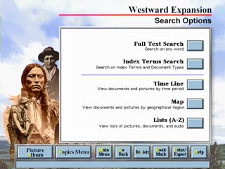
We began with line-drawing sketches, flow charts and screen layouts done in blocks of colors. We used these crude representations of the screens to determine what information would be included on each one and to experiment with different relationships between elements on the screen. After several iterations of the design we had a version that everyone liked. This let all the production departments do their work knowing how it would have to fit on the screen. For example, the writers began to work on copy-fitting as they went along so that titles and other text would fit neatly into the screen space. We had decided to have three different screen templates for pictures, to accommodate portrait, landscape and square pictures. The images were divided into these groups as they were scanned so that they could easily be assigned to the right stylesheet. From the Main Menu In While we worked on the basic display screens, we also defined all of the ways to reach a specific document or picture. Our goal was to include routes through the program for all of the different ways users might approach the program, each providing a way to find specific documents or pictures.
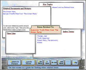
And Links In Between As we looked back to our goal of putting each document into a context, we realized that all of the access methods we had designed were ways of reaching one item, but there were very few links between items. What we came up with to solve this design goal is the Related Items screen. For each document or picture, we wanted to make it easy to find related essays and time line events and other items with the same keywords. This was a screen that was conceptually simple, but was very difficult to implement visually. Some items had many relationships; others very few. In the end, it looked like this:
Visual Landscape Meanwhile, back at the paint programs, the graphics team was working on a visual design. Most importantly, we needed screens which would form a frame for the documents and pictures, rather than competing with them. American Journey is a series, so with production costs in mind, we wanted a design that would work for all discs or be easy to customize. For the Main Menu, we used a collage of images from the collection to give a sense of the subject of the disc. The collage is the dominant image on the Main Menu. On screens one level away, a text area covers part of the collage and it disappears completely on later screens. A surprise benefit of this approach was that it limited the number of screens which had to be specially created for each disc. Designing from the Inside Out Content and information organization drive design. What made American Journey successful was that the interface was based on user needs and that the structure and visual design were carefully interrelated.
Notes (1) The core team for American Journey included from Research Publications: Chris Cipriano, Editorial, Lorie Freed, Editorial, William Reilly, Editorial Technology; and from Cognetics Corporation: Paul Hoffman, Graphic Design, Whitney Quesenbery, Interface Design, Marc Reed, Graphic Design, Cheri Lockett Zubak, Help (2) A view from Galena Summit in Idaho. I took this picture while driving from Salt Lake City to Boise Paul Hoffman of Cognetics Corporation continued to create the visual elements for these discs until 2001.
This paper was originally published in the Proceedings of the 42nd Annual Conference, Society for Technical Communication, 1995 The URL for this article is: http://www.wqusability.com/articles/aj.html Whitney Quesenbery works on user experience and usability with a passion for clear communication. She is the co-author of Storytelling for User Experience from Rosenfeld Media. Before she was seduced by a little beige computer, Whitney was a theatrical lighting designer. The lessons from the theatre stay with her in creating user experiences. She can be reached at www.WQusability.com |
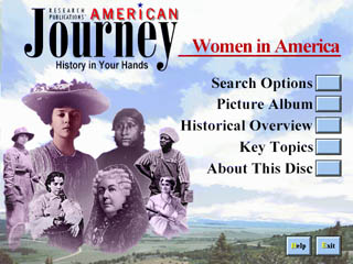 This
is the story of the interface for a CD-ROM and how it got that way. The
CD-ROM is Research Publications' American Journey, a series of discs on
topics in American history aimed at high school students. Each one contains
over 700 primary source pictures and documents, along with introductory
essays. The first two discs, Women In America and Westward Expansion were
released at the end of 1994.
This
is the story of the interface for a CD-ROM and how it got that way. The
CD-ROM is Research Publications' American Journey, a series of discs on
topics in American history aimed at high school students. Each one contains
over 700 primary source pictures and documents, along with introductory
essays. The first two discs, Women In America and Westward Expansion were
released at the end of 1994.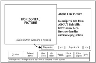 After we had a functional definition of
the project, we were ready to begin designing the key screens. For American
Journey, the most important screens were the ones which displayed the
documents and pictures.
After we had a functional definition of
the project, we were ready to begin designing the key screens. For American
Journey, the most important screens were the ones which displayed the
documents and pictures. 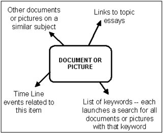
 We experimented with a number
of metaphors for the visual concept, and the one we liked the most was
that the screen was a landscape. We found a photograph of an archetypical
American landscape(
We experimented with a number
of metaphors for the visual concept, and the one we liked the most was
that the screen was a landscape. We found a photograph of an archetypical
American landscape(