|
Selected Projects
You learn from each one you do, but here are some of my favorite projects...and
what makes them favorites.
National Cancer Institute
"How can we help cancer patients learn about clinical trials for new treatments?" User research, watching patients try to use the clinical trials search feature on several different web sites, led to a better understandng of how they use search, how they cope with medical terminology, and most importantly, what they really want to know about how a clinical trial can help them.
I created personas to gather a large body of research on NCI's audience into a useful format for the evolution of the flagship cancer.gov web site.
Every other month, projects from across NCI test new communications materials in Open Call usability tests. Open Call has made it possible to test even small projects, or focus on a series of elements in a larger project. (2005 - present)
Visit Cancer.gov's clinical trials search »
Visit AccrualNet »
Visit Cancer.gov »
 The
Open University The
Open University
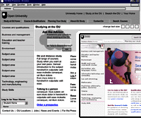
A large distance-learning university, the OU relies on its web site for admissions information, registrations and as the student classroom. Usability testing, site traffic anlysis, card sorting and user research
were all put to work. The result? According to
Ian Roddis, the university web director, "Over the year the increase
due to better website design, equates to over £2 million!"
(2002 - 2010, with Effortmark)
Visit the
Open University »
Learn about OU distance learning »
Read "More Alike Than We Think" »

Eli Lilly E-Marketing Web Sites
New templates to increase usability, personas development, usability process,
research into search - and helping make a whole family
of web sites work better for users. Who
could ask for more? (2001-2002, at Cognetics
Corporation)
Novartis Consumer Health InfoWeb
The InfoWeb was a dream project to design a knowledge management system.
The team created a set of tools that have survived a corporate reorganization
and the other changes that time brings. Our secret was that we started
from what we learned from users around the world to fill gaps in the information
that was available to them...and preserved systems that were already working.
(1996-1998, at Cognetics Corporation)
Read "Lessons from the InfoWeb" »
 ICP's
Weegee's World Online Exhibit ICP's
Weegee's World Online Exhibit
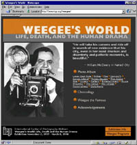
This one was just fun. I got to work with a newly released set of photographic
archives to create an online exhibition to accompany a new book and an
exhibit at the International Center of Photography in New York.
Visit
the online exhibition »
Primary Source Media's American Journey
These CD-ROMs were a blend of hypertext and search, and through them I
learned a lot about how to organize a collection of documents to encourage
exploration. (1995-1997, at Cognetics Corporation).
Read about this project »
The HP LaserJet 4 Travel Guide
This was the project that taught me about usability. The entire product
went through several rounds of usability testing. After the first test,
I watched 24 hours of video tape, and got a healthy dose of design humility
in the bargain. But the end result was a hypertext document - in 1992,
before the Web - that was so easy to use that there were virtually no
technical support calls. The design and information architecture was used
for several years, as new printers were released. (1991-1992, at Cognetics
Corporation)
|
|

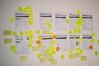
Analysis of usability test comparing two approaches to a design.
Industry Projects
I believe in being active in the professional community.
Here are links to some of my recent projects.
US Access Board
Section 508, the US accessibility regulations are being updated, and I represented UPA on the Federal Advisory Committee helping with this work.
Field Guides to Ensuring Voting Intent
Pocket guides to designing ballots, voter education materials and writing instructions voters understand.
Voting
and Usability
Triggered by the 2000 Presidential election, a
look at how usability contributes to free and fair elections
|

