| Home What we do Storytelling for User Experience Articles and downloads About us |
|
GetSmart: by Whitney Quesenbery GetSmart combines a full-length magazine with brief, to-the-point articles and columns on personal and work-related issues with a database of resources on personal development. Aimed at busy knowledge workers, the content had to be rich, pertinent and accessible. Unlike many CD-ROM publications, GetSmart includes many text-based articles an a graphic and multimedia-rich environment. The target audience includes computer novices as well as power users, so the publication was designed to be visually engaging and easy-to use, but without sacrificing any of the depth and interest of the best hypermedia applications. The project team brought together an editorial staff from the traditional print world and a design and production team experienced in CD-ROM development. With a deadline to meet, the team had to quickly learn to work together. Some of the critical issues in the design, editorial and production processes came at the places where the print magazine culture and the multimedia culture had to adapt to each other. Bridging the expectations of a magazine and the realities of on-screen reading The technology of magazine production is well established. Editors have access to high-resolution print screens, and can use a wide variety of fonts, layout designs and graphics to create attractive and readable pages. Readers are used to seeing a lot of information on a single page - some in body text, some in sidebars or callouts. On screen, by contrast, the resolution is relatively low - 72 dpi as opposed to 2400 dpi. Readers are not yet accustomed to reading directly from the screen, and an overly cluttered screen or one with fonts which are too small can quickly become unreadable.
Designing screen layouts We wanted to be able to use standard layouts to simplify production, but we also wanted to be able to customize each article to maintain variety and interest. One complaint the "print people" had with computer programs was that the screens all looked to much alike. We also wanted a graphical device to differentiate the departments and columns from each other, to help readers keep track of their location in the magazine.
We defined several different templates, and arranged the article sequence to create the maximum variety. There was a special one-page template for extremely short articles, called "In Briefs." The overall effect was to create a variety of designs, while still following a standard template model. Creating hypertext navigation that is both powerful and intuitive One of our most critical concerns was that the navigation be extremely easy, and that readers never get "lost" in the magazine. GetSmart is marketed to a general business audience, not specifically to computer users. In our usability tests, we included people who had never used a computer, or had never used a graphical interface or mouse. One technique we borrowed from the print world was the running head. At the bottom of every screen, in olive type, we repeated the title of the article. This header carried through to hypertext links within an article, too. Rather than scrolling the text on a single screen, we broke it into pages (actually, the pagination was handled automatically by the software), and numbered the pages. We felt this was important for three reasons:
Choosing an authoring tool: multimedia program or hypertext program
The search problem was particularly important because the magazine includes a database of resources, the Resource Room, which were intended to be accessed through both keyword and full-text search. We could have created the Resource Room in an external database program, but preferred to keep it integrated with the rest of the magazine. In the end, we decided to use our own hypermedia program, Hyperties. Although not primarily a multimedia program, it had several other features which were important to us.
We expected the premiere issue’s production to be very intensive because there were so many decisions to make, but we wanted an authoring tool that would allow subsequent issues to be produced both with less labor and in a more distributed work environment, and Hyperties fit the bill. Conclusion The hardest task we faced as a group was to develop a shared vocabulary and vision. Learning how to talk together about the design of an online magazine was a critical part of the process – and one that went on during the whole production period.
This paper was published in the Proceedings of the 43nd Annual Conference, Society for Technical Communication, 1996 Many people worked on GetSmart. Marc Reed, the visual designer, produced the amazing graphics which give this disc a special look. Chris Shields did all of the Hyperties coding and markup, and was the primary interface between editorial and production. Jodie Green was the editor-in-chief and Doug Crisman, the publisher led the creation of the Resource Room database. Me? I worked on the interface design and helped cajole the disc into being. The URL for this article is: http://www.wqusability.com/articles/getsmart.html Whitney Quesenbery works on user experience and usability with a passion for clear communication. She is the co-author of Storytelling for User Experience from Rosenfeld Media. Before she was seduced by a little beige computer, Whitney was a theatrical lighting designer. The lessons from the theatre stay with her in creating user experiences. She can be reached at www.WQusability.com |
 However, we were committed to the idea
that the magazine would be read on the screen, rather than using the CD-ROM
as a transport medium for print-on-demand. To resolve this design conflict
we devised the following rules:
However, we were committed to the idea
that the magazine would be read on the screen, rather than using the CD-ROM
as a transport medium for print-on-demand. To resolve this design conflict
we devised the following rules:
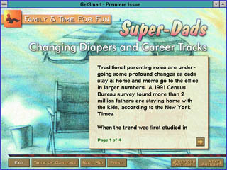
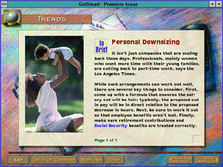 Our solution was to create a background
graphic for each department which reflected the subject matter, and could
be a watermark under each article. The headlines for each department used
a similar type style, so that there was a consistency within each one.
On the "inside" screens of each article, the text area was widened,
and a graphic was placed on the screen in the background, with the text
wrapped around it. This graphic served to shorten the line-length and
increase readability while also providing a consistent point of interest
for each article. Other, smaller, illustrations were included in the article
content, so that the text would wrap around them.
Our solution was to create a background
graphic for each department which reflected the subject matter, and could
be a watermark under each article. The headlines for each department used
a similar type style, so that there was a consistency within each one.
On the "inside" screens of each article, the text area was widened,
and a graphic was placed on the screen in the background, with the text
wrapped around it. This graphic served to shorten the line-length and
increase readability while also providing a consistent point of interest
for each article. Other, smaller, illustrations were included in the article
content, so that the text would wrap around them.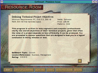 We had a great deal of difficulty in deciding
which authoring paradigm was correct for this magazine. The original demo
was created in Director. This was an attractive option because it offered
good multimedia control and screen animation. Its weaknesses from our
point of view were its relatively weak text handling and lack of a markup
language, its lack of search capability, and the fact that it is difficult
to have several people work on a single Director project.
We had a great deal of difficulty in deciding
which authoring paradigm was correct for this magazine. The original demo
was created in Director. This was an attractive option because it offered
good multimedia control and screen animation. Its weaknesses from our
point of view were its relatively weak text handling and lack of a markup
language, its lack of search capability, and the fact that it is difficult
to have several people work on a single Director project.