| Home What we do Storytelling for User Experience Articles and downloads About us |
|
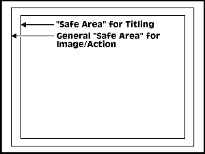
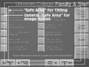
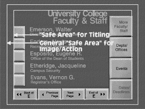
Designing for Interactive Television Whitney Quesenbery and Todd Reichart Interactive television is one of the many new information delivery systems which technical writers will need to master in the coming years. CD-I, games systems, in-house information systems, and cable modems all use the conventional television screen for their displays. As in every medium, there are technical considerations and audience demographics which influence the design process. A Television Screen is Not a Computer Screen We are so accustomed to watching television that we easily overlook the limited resolution of the television screen. Compared to TV, even VGA looks good. Although both use a similar display monitor, they differ in both the way the screen is "painted" and in how much information can be placed on the screen. To design effectively for interactive television, it is essential to understand the technical constraints of the medium. The American TV standard, called NTSC (for the National Television Standards Committee), was designed for handling data in a broadcast stream. In an NTSC signal, there are 525 scan lines making up one complete image frame, and 30 frames are drawn each second. Using a technique called interlacing, only half the lines are drawn at one time, with the other half filled in on the next pass. Human persistence of vision makes this technical trick possible. But, interlacing also accounts for the flicker in a television image. The computer can use video memory to assemble an entire picture and send it to the screen in one operation. This avoids the need for interlacing and results in a more stable screen image. Rather than dividing the screen into scan lines, a computer image is divided into dots called pixels. In the computer world, the number of pixels on the screen, or the screen resolution is established by the hardware. DOS/Windows screens can be set to different resolutions, measured in the number of pixels in each dimension – for example, 640 by 480 for VGA. Mac monitors can also be set to specific resolutions (older Macs used 72 dots-per-inch, which is approximately 640 by 480 on a 14" screen). In order to be able to use computer-based tools, we approximate the relationship between the two screens, and usually work in a 640 by 480 image. But, this measurement is just an approximation. The vertical measurement -- 480 pixels -- is close to the visible portion of the 525 scan lines. The horizontal measurement – 640 pixels – is double the average horizontal resolution of the NTSC screen. Unlike a computer screen, the actual display boundaries of commercial television screens vary greatly from set to set. They do not display the complete picture, and the area of the picture which is displayed varies from one receiver to another. The part of the picture which any receiver is guaranteed to display is called the safe area, and it is an important consideration in any design.
Most computer screen design pushes the controls to the edge of the screen. The idea is to create as large a display area (or work area) as possible. But look what happens when the safe area is drawn over a typical screen. Clearly, we have to change our basic ideas about how a screen is laid out. Another critical factor in screen design for ITV is the distance between the viewer and the screen. When using a computer, we typically sit within two feet of the monitor, well within most people’s primary vision, but when viewing television we normally sit four to six feet from the set. In fact, the interlacing on a television display makes it hard to view at close range. This means that controls and text must be oversized so they can be read from a distance.
Color and Fonts You’ve probably heard advice about how to dress for video – not to wear solid white or small patterns and checks, for example. Interfaces have the same problems, all caused by the interlacing. Since only half of the scan lines are drawn at a time, it is important to avoid small patterns, or designs with a horizontal lines which are only a single pixel high as they will tend to flicker or pulse. Another problem is the low fidelity of the color reproduction. Not only do colors look different on the television screen than they do on a computer screen, but they are not displayed consistently. In fact, there is an industry joke that NTSC stands for "Never the Same Color." This problem is balanced by the fact that an almost infinite number of colors can be displayed. Some colors, especially those with a lot of red, tend to bleed, spilling into neighboring pixels. This makes those colors bad choices for fine detail or text. At the other end of the spectrum, blues are very stable, and make good backgrounds. This is partly caused by the physical hardware. If the three color guns in the cathode ray tube (CRT) are not perfectly aligned, each dot may be painted as two or even three dots. This causes colored fringes around objects and, by blurring the colors, blurs the image. All the limitations of the NTSC signal come to bear on the display of text on the television screen. The detail in text is difficult to render at the low screen resolution, color bleed and interlacing flicker can make text hard to read, and the large text size required for legibility make screen layout a challenge. Like early graphical screens, or machines like the Commodore 64 which used a television screen as a monitor, an ITV screen can display only 40 or 50 characters on one line. There are a few simple guidelines to start with for handling text:
During ITV development, it is very important to see your work as viewers will see it. One way to do this is to check your work in the DOS CGA (320 by 200) mode. The low resolution of this graphics mode will help you remember that you are designing for NTSC. This is also a good way to develop screens with no flicker. When these screens are scaled to 640 by 480, all of the pixels are doubled, so that both of the interlacing passes draw the same information on the screen. If you have the budget, you should purchase a hardware device called a scan-converter (we used a HyperConverter 1024 from PC Video Conversion Corporation, San Jose, CA. It is an external device for either Mac or PC which allows both the computer monitor and a television to display the screen at the same time. ) which takes the VGA output from the computer and converts it to the NTSC television video standard. This video signal is fed to a consumer-grade television set. We work from the VGA monitor and frequently reference the television screen which has been placed at a comfortable viewing distance. Seeing the image on both screens at the same time allows the developer to constantly assess the effects of design decisions. Designing Navigation Historically, television viewing has been a passive experience. Interaction was limited to channel surfing and occasionally turning the box off. Even the game boxes that use the television screen have a relatively limited repertoire of interactions. The linear metaphor of going up or down the available channels is being replaced by the ability to move in two dimensions on a particular screen, forward and back among screens, and moving between applications. When you start thinking about the interface and navigation, the problems can get really tricky. For one thing, there probably won’t be a keyboard, and there may not be a direct pointing device like a mouse or trackball. Remember those old DOS applications where you could only move around the screen by pressing the arrow keys? Many ITV applications must run using only a remote control device, with four arrow keys and a select key. When the navigation is this limited, you must take care in the arrangement of navigable objects on the screen. For example, group functional buttons into one column and navigational buttons into another. Moving from one group to the other is one click left or right. Minimize the number of button presses that the user must make to use your screens. The common interface metaphors of computer work environments such as buttons, drop-down menus, and scroll bars are not yet established in the interactive television medium. Developers must clearly identify what actions are possible and how they are done, without the Mac or Windows GUI standards as part of the requirements for design decisions. Introductory help, oversized interface elements, and audio help are possible solutions to ensure that viewers can use the interface successfully. The typical television experience is one of constantly moving image and sound. The relatively low resolution of the television screen does not present text or detailed images well. But if the screen objects are always in motion, the viewer never has a chance to find the resolution objectionable. We have come to think of static television screens as an indication of something wrong back at the television station. Use moving images and animation to add interest to your screens and to disguise the limitations of the medium. Working in a new medium gives us a chance to encounter and solve problems that have never been confronted before. We have the opportunity to participate in the definition of this new medium through the development of groundbreaking services and applications. Let’s get to work.
References and Further Reading
Other articles with information on color and resolution:
We wrote this article in 1996 after creating two ITV demos for Ameritech. We had a lot to learn about designing for an NTSC screen. Updated July 20, 2005 to correct information about Mac screen resolutions and add additional resources. The URL for this article is: http://www.wqusability.com/articles/itv-design.html Whitney Quesenbery works on user experience and usability with a passion for clear communication. She is the co-author of Storytelling for User Experience from Rosenfeld Media. Before she was seduced by a little beige computer, Whitney was a theatrical lighting designer. The lessons from the theatre stay with her in creating user experiences. She can be reached at www.WQusability.com |
 Designing
for a Television Screen
Designing
for a Television Screen
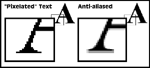 Not
everyone likes the soft-edged look that anti-aliasing gives to text on
a computer screen. On an NTSC screen, however, the feathered transition
between letter and background help mask color alignment problems, making
anti-aliasing a must for ITV design.
Not
everyone likes the soft-edged look that anti-aliasing gives to text on
a computer screen. On an NTSC screen, however, the feathered transition
between letter and background help mask color alignment problems, making
anti-aliasing a must for ITV design.